一个很好看的网页时钟——JavaScript实例
HTML结构
HTML中包含一个带有
clock类的<div>元素,作为时钟的容器。在这个容器内部,还有三个表示时钟的时针、分针和秒针的
<div>元素(hour、min、sec)。这些元素内部又包含用于视觉表示的hr、mn和sc类的<div>。
CSS样式
通过
*选择器重置了所有元素的边距和内填充,并设置了box-sizing为border-box,以确保布局更加一致。在
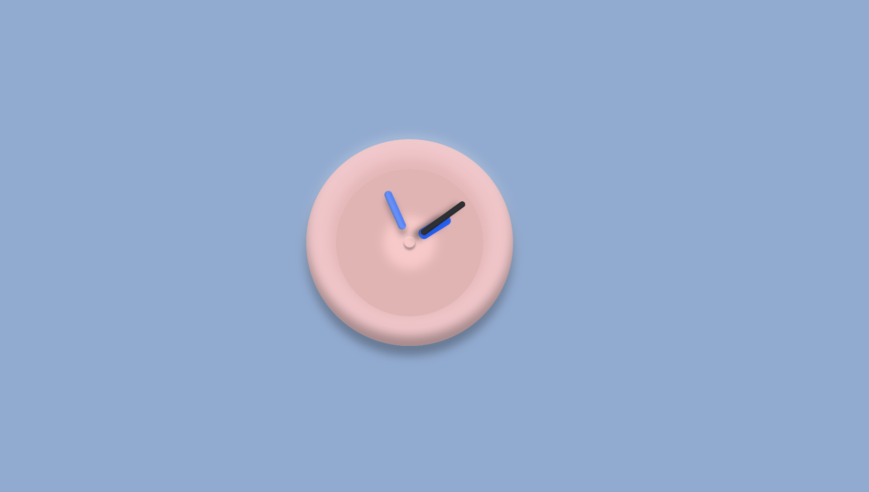
:root中定义了自定义CSS属性(变量),便于维护和修改配色方案。body设置为在水平和垂直方向上居中显示其内容,背景为渐变色。.clock类设置了一个圆形、带阴影和略微透明的容器,模仿了经典模拟时钟面的外观。伪元素(
:before和:after)在.clock中被创造性地用来添加中心针和背景阴影等装饰效果。.hour、.min和.sec类及其子:before伪元素,对时钟的指针至关重要。它们使用绝对定位来进行对齐和旋转。可以添加CSS过渡效果(虽然在你的代码片段中没有显示)来平滑地动画显示时钟指针的移动。
JavaScript功能
脚本计算当前时间并使用CSS变换更新每个时钟指针的旋转。
setInterval函数每秒更新这些旋转,使时钟指针实时移动。每个指针根据其各自的时间度量旋转,将时间转换为度数(圆形中有360度):
小时:每小时等于30度。
分钟和秒钟:每分钟或每秒增加6度。
<!DOCTYPE html>
<html lang="en">
<head>
    <meta charset="UTF-8">
    <meta http-equiv="X-UA-Compatible" content="IE=edge">
    <meta name="viewport" content="width=device-width, initial-scale=1.0">
    <title>一个很可爱的网页时钟</title>
    <style>
        * {
            margin: 0;
            padding: 0;
            box-sizing: border-box;
        }

        :root {
            --bg: linear-gradient(rgb(145,170,207), rgb(145,170,207));
            --fg: #17181c;
            --primary1: #255ff4;
            --primary2: #5583f6;
        }

        body {
            display: flex;
            justify-content: center;
            align-items: center;
            min-height: 100vh;
            background: var(--bg);
            /* 这个还可以再研究下 */
        }

        .clock {
            width: 350px;
            height: 350px;
            /* 利用flex布局,将时钟、分针、秒针定位到钟的水平垂直剧中的位置 */
            display: flex;
            justify-content: center;
            align-items: center;
            border-radius: 50%;
            background-color: rgba(250, 200, 200, .9);
            /* 添加阴影效果 */
            box-shadow: 0 -1em 1em rgba(0, 0, 0, 0.3) inset,
                0 0.5em 1em rgba(255, 255, 255, 0.1) inset,
                0 -0.5em 1em rgba(255, 255, 255, 0.2),
                0 1em 1em rgba(0, 0, 0, 0.3);
        }

        /* 利用伪元素在钟的中心添加一个点 */
        .clock:before {
            content: '';
            position: absolute;
            width: 20px;
            height: 20px;
            border-radius: 50%;
            z-index: 100;
            box-shadow: 0 0.1em 0.1em rgba(255, 255, 255, 0.3) inset,
                0 -0.1em 0.1em rgba(0, 0, 0, 0.3) inset,
                0 0.2em 0.2em rgba(0, 0, 0, 0.3);
        }
        .clock:after {
            content: '';
            display: block;
            border-radius: 50%;
            position: absolute;
            box-shadow: 0 0 1em 5em rgb(0, 0, 0) inset,
                0 -0.5em 1em 0.5em rgba(0, 0, 0, 0.8);
            width: 250px;
            height: 250px;
            background-color: rgb(226, 214, 214);
            z-index: -99;
        }
        .clock .hour,
        .clock .min,
        .clock .sec {
            position: absolute;
        }

        .clock .hour,
        .hr {
            width: 160px;
            height: 160px;
        }

        .clock .min,
        .mn {
            width: 160px;
            height: 190px;
        }

        .clock .sec,
        .sc {
            width:230px;
            height: 230px;
        }

        .hr,
        .mn,
        .sc {
            display: flex;
            justify-content: center;
            position: absolute;
        }
        .hr:before,
        .mn:before,
        .sc:before {
            box-shadow: 7px -0.6px 2px 2px rgba(255, 255, 255, 0.1) inset,
                2px 0.2px 2px rgba(0, 0, 0, 0.2) inset,
                -3px 10px 10px rgba(0, 0, 0, 0.3);

        }

        .hr:before {
            content: '';
            width: 8px;
            height: 80px;
            background-color: #ff105e;
            z-index: 10;
            border-radius: 6px 6px 0 0;
            background: var(--primary1);
            border-radius: 0.5em;
            width: 18px;
            height: 60px;
        }

        .mn:before {
            content: '';
            width: 4px;
            height: 90px;
            background-color: #fff;
            z-index: 11;
            border-radius: 6px 6px 0 0;
            background: var(--primary2);
            border-radius: 0.4em;
            width: 13px;
            height: 70px;
        }

        .sc:before {
            content: '';
            background-color: #fff;
            z-index: 12;
            background-color: var(--fg);
            border-radius: 0.3em;
            width: 10px;
            height: 90px;
        }
    </style>
</head>
<body>
    <div class="clock">
        <div class="hour">
            <div class="hr" id="hr"></div>
        </div>
        <div class="min">
            <div class="mn" id="mn"></div>
        </div>
        <div class="sec">
            <div class="sc" id="sc"></div>
        </div>
    </div>
</body>
<script>
    const deg = 6;
    const hr = document.querySelector('#hr');
    const mn = document.querySelector('#mn');
    const sc = document.querySelector('#sc');
    setInterval(() => {
        let day = new Date();
        let h = day.getHours() * 30; //1小时等于30度
        let m = day.getMinutes() * deg; //1分钟等于6度
        let s = day.getSeconds() * deg; //1秒等于6度
		hr.style.transform = `rotateZ(${(h + (m / 12))}deg)`;
        mn.style.transform = `rotateZ(${m}deg)`;
        sc.style.transform = `rotateZ(${s}deg)`;
    },1000)

</script>
</html>